The Color Wheel: What it is and How to Use it to Your Advantage
By Amy Hand
--
Hey there Smart Art friends!
Welcome back to another great month of Smart Art fun, I promise you this month is going to be killer!
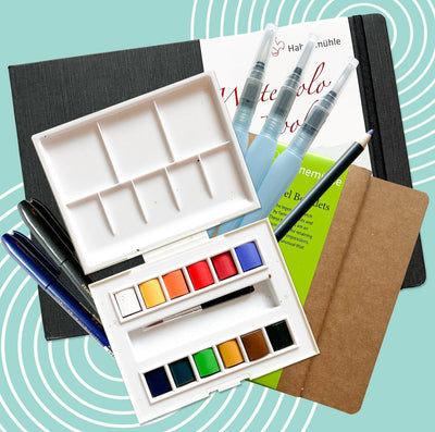
After last month's precise paintings, now we’re flipping things on their head to bring you alcohol inks! The swirling, marbling inks that have a mind of their own. That may sound intimidating but, as you can see from the brochure, there are a lot of fun ways to harness and combine your techniques with ink to create pieces that are out of this world. From marbled pools of ink to the most defined details with your markers; ink is going to take you on a ride!
When you’re a beginner or just starting out with a new medium it's easy to get overwhelmed. With so many colors on offer it's really hard to choose your color palette and know when to listen to your ‘that’s enough’ instinct. But never fear, we are here with a little bit of color theory to guide you to create the most beautiful ink pieces possible.
We’re going to take it back to basics, dive into the color wheel and even show you how to use it to make your art the best it can be
The Color Wheel & Color Theory
I’m sure you’ve all seen a color wheel before but just in case you’re not sure it's this:

It basically takes all the colors, excluding hues and shades, and arranges them on a wheel in the order in which they’re created. Secondary colors sit between primary and tertiary dividing them.
Color theory is the way these colors are mixed to create different shades and how different parts of the wheel interact with one another. Understanding the color wheel is a beginner’s step in anyone’s art journey because it really allows you to grasp how color interacts with each other and how you can bring that into your own art. This is most important in mediums like ink and paint where you’re always mixing new shades so it’s a great bit of knowledge to have since you’re about to embark on your ink adventures!
Now, let’s have a look at some artsy terms to make this a little easier to understand. The colors are categorized into three main color groups:
Primary colors: If you went to kindergarten you know what these are! Red, yellow and blue. These are the big daddy colors that all other colors are born from (this is not considering hues and shades, that’s its own story).
Secondary colors: These are what you get when you mix two primary colors together. So that’s green, purple and orange.
Tertiary colors: An often forgotten subset of colors, tertiary colors are what you get when you mix a primary color with the secondary color beside it. That will give you colors like blue-green, yellow-orange and red-purple.
They can further be divided into:
Complementary colors: These are colors that sit directly across from each other on the color wheel like green and red or blue and orange. When paired beside one another these colors accentuate each other unlike any other color on the wheel. However if you mix them together they will cancel each other out and make a gray or brown shade.
Analogous colors: Now you might not know this one if you’re new to color theory. These are colors that sit next to each other on the color wheel. So for example: red, red orange and orange. These colors can be used to create an even ombre from one color to another. You do have to be careful when mixing these shades however because they can overmix and all blend into one shade very easily.
Hues and Shades: Although not a part of the color wheel and they don’t apply for your inks we’re going to explain them anyway for future reference. Shades and hues happen when you mix white or black with one of the shades on the color wheel to g=create a darker or lighter version of the original. So you can mix white with red to make pink which is a shade of red so it doesn’t have a place on the color wheel.
As you can see from all of this, there’s more to it than just mixing together red and blue and making purple. What if there’s more red than purple? Or the other way around? This is why the slices between the primary and secondary colors are so important to consider when planning your mixing. This color science is now your secret weapon when you’re making any art from now on!
How to Use Color Theory in Your Art

Right, so with all that knowledge in mind; how can you use this to make beautiful ink art?
In the brochure we show you how to apply inks onto paper and blow them using the silicone hand blower so they marble across the paper. With color theory in your creative arsenal you can plan what colors to use beside one another and know what colors they will create when they collide. We have also given you markers and ball tools to add details and layer on top of other shades, color theory can help you pick these shades so it has the most visual impact.
This will not only make your pieces really cohesive and visually stunning but you’ll also avoid having any mishaps when the wrong colors combine to make a murky brown.
Here are a couple of tips on how to use this new knowledge to make your ink pieces shine:
- The number one rule when using inks in this way is: limit your colors. The worst thing you can possibly do is add too many colors and come out with a brown, muddy mess. Pick a few colors and, using color theory, have an idea of how they will react with each other to create colors that really pop and bring each other to the forefront.
- Try playing with analogous colors to create a color scheme that leans more cool or more warm for a monochromatic look that is very easy on the eye.
- You can even use complementary colors to make the shades stand out rather dramatically but make sure they’re mixing with other shades and not with each other. This is when using a third buffer color is a good idea, or just leave enough space between shades to prevent them mixing.
- For a really dramatic and bright piece work with a primary color as a base color and plan from there. You could pair a right yellow with a blue that creates a bright green on impact.
- Try using one shade for the wash of ink that you blow and let that dry fully. Then use the ball tools to dot a pattern work of the complementary color on top to make it really pop.
- Create areas of color. So, like the dreamcatcher in the brochure, you can pick a few color families to use in the same piece with only a few shades mixing in each area. This let’s you bring in a lot of color without them mixing into something unappealing and muddy.

Those are all the tips and tricks we have for you today! I hope you enjoyed learning a little bit about color theory and you feel inspired to take this info and use it to make pieces that are thoughtful, bright and cohesive.
We really can’t wait to see what ink creations you come up with this month so don’t be shy to share with us using the hashtags.
Have fun and see you next month!
